Why Hungry Users Don't Wait
· 7 min read
Picture yourself after a long day. Your stomach is growling. You just want a hot meal without the hassle. You pull out your phone and open a restaurant website. The menu takes forever to load. The buttons feel too small. You close the tab and open another app instead. This scene plays out thousands of times.
Hunger changes how people think. It narrows focus. It speeds up decisions. A person looking for food online is not browsing for fun. They have a goal and they want to reach it fast.
This mindset shapes every tap and swipe on a food ordering site. Small frustrations feel bigger. Delays feel longer. A smooth experience feels like a relief.
Understanding this headspace is the first step to building a better ordering system. The next section dives into what really drives a hungry customer.
The Psychology of the Hungry Customer
Decision Making on an Empty Stomach
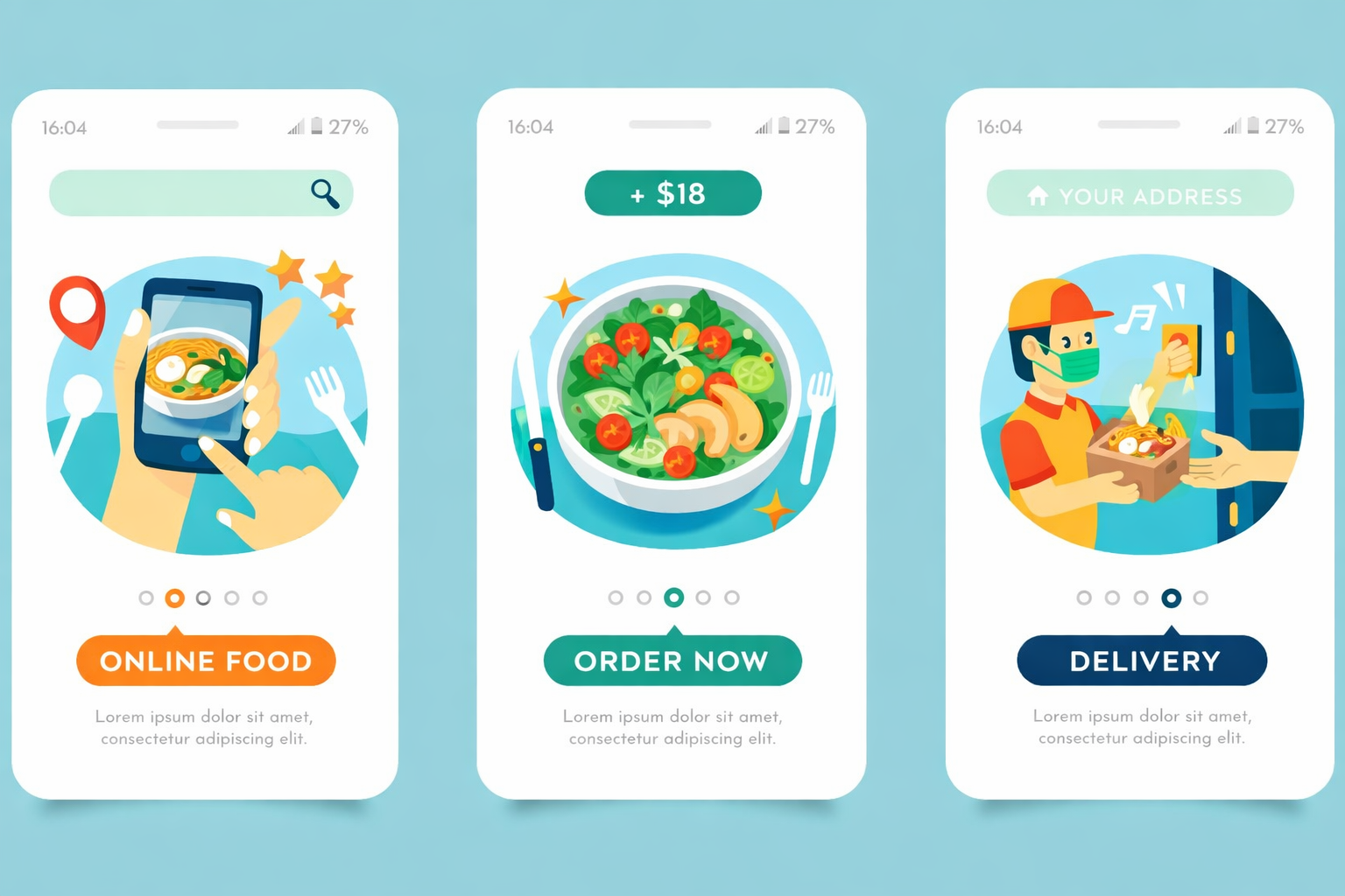
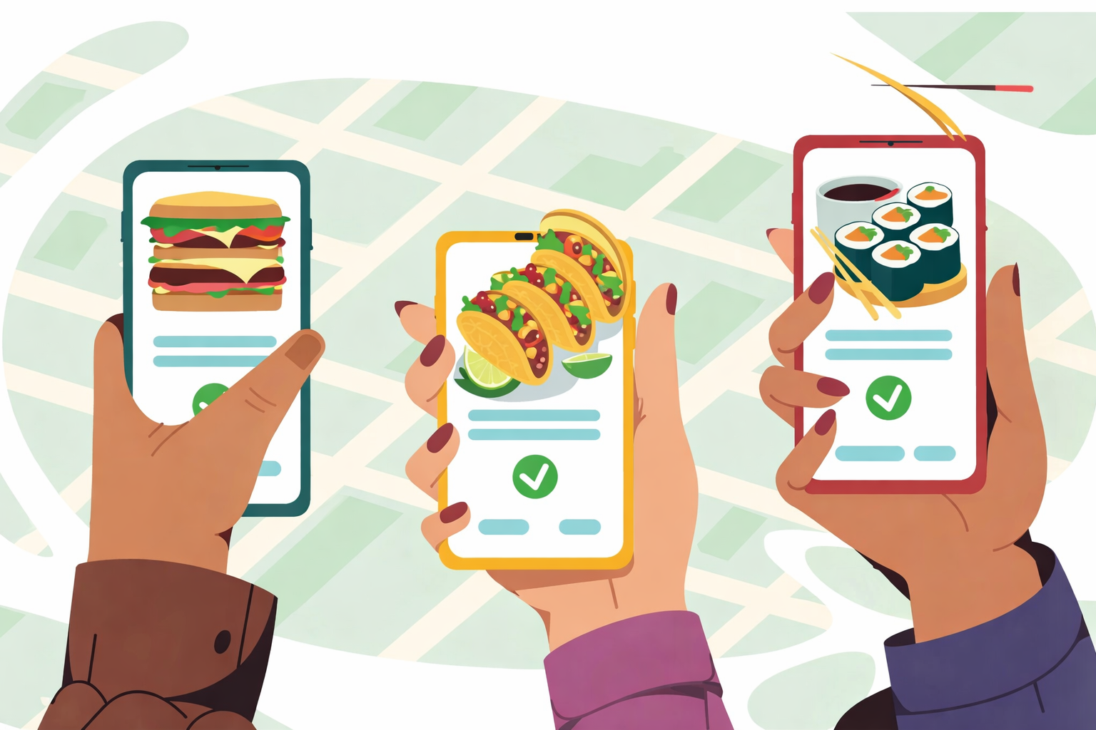
Hunger changes how a brain works. Choices become instinctive. People look for pictures of food first. Text takes too much effort to read. A clear image speaks faster than a description. Complex menus cause hesitation. Simple lists move people toward the checkout. Visual cues trigger appetite quickly. A cluttered screen slows that trigger down.
Why Patience Runs Low During Meal Times
Lunch breaks are short. Dinner hunger feels urgent. Time feels different when you need fuel. A loading screen feels like a wall. People close tabs when things stall. Speed matches the urgency of the need. Waiting feels worse on an empty stomach. A slow site fights against biology.
How Seamless Experiences Drive Repeat Orders
Good feelings stick in memory. People return to places that feel easy. Friction makes them look elsewhere. Smooth flows become habits. A seamless order feels like a service. People repeat what feels natural. Marketing works best when the path is clear. Happy customers come back without being asked.
Why Speed and Simplicity Win Orders
Speed and simplicity are the keys to success for any food ordering system. They convert casual browsers into paying customers before any doubts can arise. Let's take a closer look at complexity.
Friction Leads to Cart Abandonment
Every extra click adds weight to the process. Users count steps without realizing it. A confusing button stops the flow. Complicated forms make people pause. That pause often becomes an exit. Shoppers leave when the path feels heavy. They seek the easiest route to their meal. Simple designs keep the momentum going.
Trust Builds When Things Work Smoothly
Glitches create doubt. A broken image looks unprofessional. Slow loading times suggest poor maintenance. Users worry about their payment info on shaky sites. Everything working as expected sends a silent message. It says the restaurant cares about details. Confidence grows when the site responds instantly. People trust platforms that feel solid.
Competing With the Big Delivery Apps
Giant apps set the standard for speed. Customers expect that same level of polish everywhere. They compare your site to those huge platforms daily. Your ordering system must match that rhythm. Clunky interfaces lose against streamlined giants. A fast and simple site holds its own. It proves you can deliver a top-tier experience directly.
Critical Areas to Test in Your Ordering System
Every system needs verification before it faces real users. App testing reveals the hidden issues that could drive customers away. It does not matter how powerful your tools are. Unchecked assumptions create gaps in the experience. Testing any platform, big or small, separates a good idea from a reliable service. These critical areas deserve your full attention before launch:
-
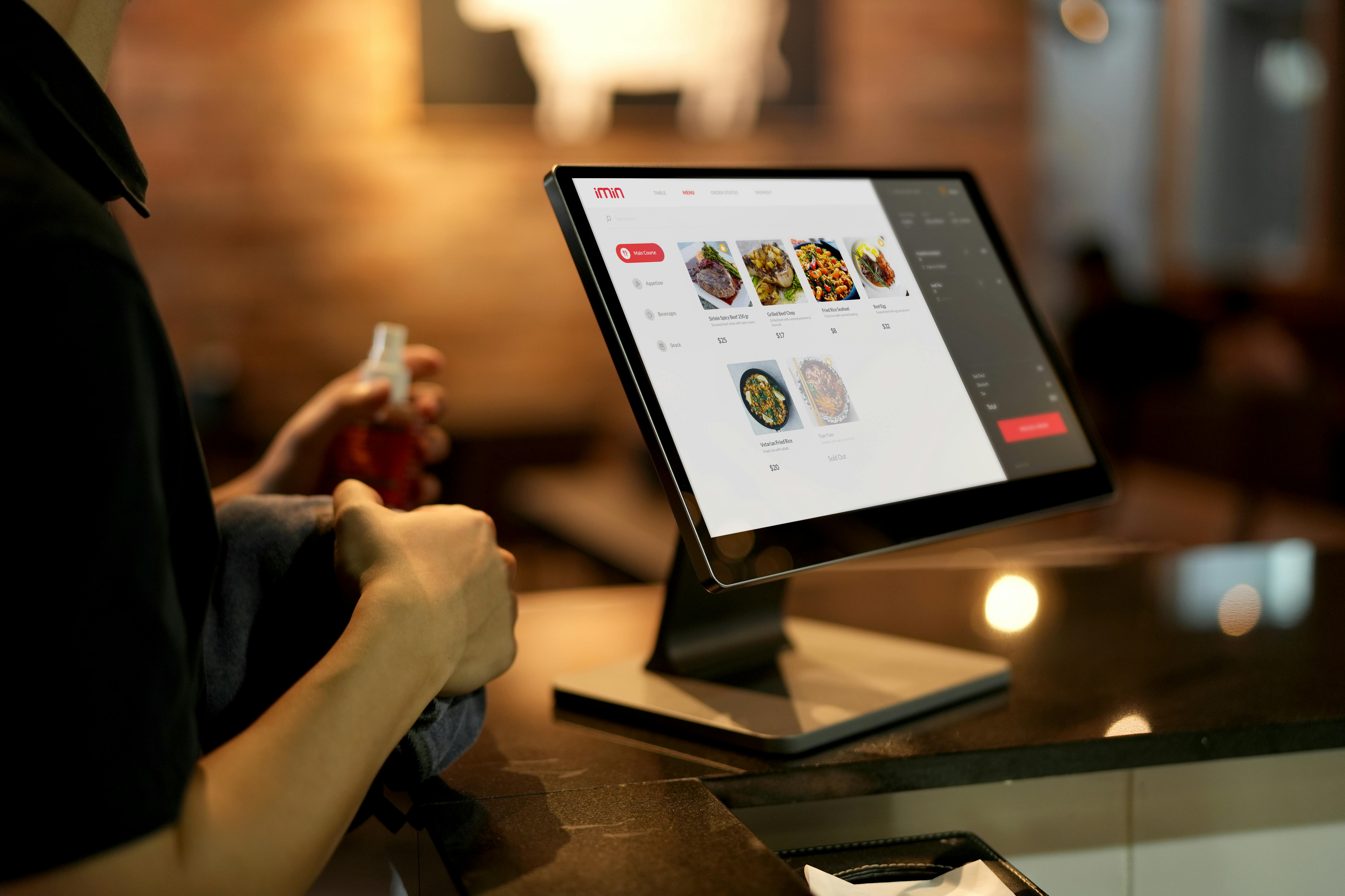
Menu images and descriptions load correctly
High-quality photos sell food. Blurry images kill appetite instantly. Check every picture on slow connections. Ensure descriptions appear fully without cutting off text. Missing prices confuse customers immediately. Verify that special labels like "Spicy" or "Vegan" show up clearly. Visual consistency builds a professional look.
-
Modifiers and extras calculate proper prices
Customers love to customize their meals. They add extra cheese or remove onions. These choices must update the total cost in real time. A static price after adding extras causes shock at checkout. Test every combination of options. Ensure the math works for single items and large orders. Accurate pricing prevents disputes later.
-
Checkout forms
This is where most orders get lost. Keep fields to an absolute minimum. Ask only for what you truly need. Auto-fill features save valuable seconds. Error messages must point exactly to the problem field. Vague alerts frustrate users into leaving. The payment button should be large and obvious. A smooth finish seals the deal.
-
Order notifications reach the kitchen instantly
The digital order must become a physical task quickly. Test the connection between the website and the kitchen display. Delays here mean cold food and angry staff. Confirm that emails or SMS alerts arrive without lag. The system should handle multiple orders at once without mixing them up. Reliable communication keeps the kitchen running smoothly.
How to Run a Quick Test Before Going Live
-
Use a Staging Environment First
Never test changes on the live site. A staging area acts as a safe sandbox. You can break things here without losing real orders. Developers push updates to this space first. It mirrors the real website perfectly. Fix bugs in private before the public sees them. This step keeps your reputation clean.
-
Ask Friends to Try the Happy Path
Fresh eyes spot what you miss. Invite friends who know nothing about your system. Give them one simple task. Ask them to order a specific meal. Watch them silently while they do it. Do not help them when they hesitate. Their confusion highlights weak spots in the design. Smooth success here means you are ready.
-
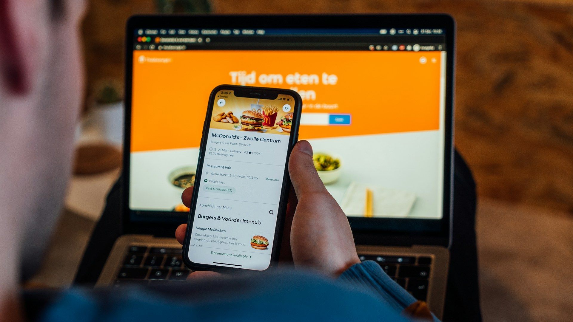
Test on Real Phones Not Just Desktops
Most customers order from their pockets. Desktop screens may hide mobile UI problems. Hold an actual phone in your hand. Try tapping buttons with your thumb. Scroll through menus on a small screen. Check how the keyboard pops up on different devices. What looks great on a monitor might fail on a phone. Real hardware reveals real issues.
-
Check Error Messages for Clarity
Mistakes happen during every order. Users forget fields or type wrong numbers. The system must tell them how to fix it. Vague errors like "Something went wrong" cause panic. Specific messages guide users back on track. Tell them exactly which field needs attention. Clear instructions turn frustration into a quick correction.
Conclusion
Choosing a food ordering system is a major step. It is not just about picking a pretty design. This choice sets the boundaries for your entire business operation. A weak platform creates cracks that show up later when you least expect them. The right platform should feel like a partner, not a hurdle.
Hungry customers are a valuable asset. They arrive with high intent and ready to spend. You have only a few minutes to capture their attention before they drift away to a competitor. Their hunger drives them, but it also makes them unforgiving of mistakes. Every second counts in this window of opportunity. A strong system and proper testing go hand in hand. One supports the other in this business.
Let every visitor know that they are understood and they will come back to you again and again.